Posts by briansia (8)

A Practical Use Case of Page Swapping

Problem

Recently, I had to deploy a React project on a Linode server. What I didn't know was that the server only has 1GB of RAM. When I tried  npm run build I got the following error.

Allocation failed - JavaScript heap out of memory

Node's Memory Problem

Node is notorious for having a lot of poorly written modules. If the module's writer does not know how Node leverages memory, then the modules consume a lot of RAM. So what looks like a simple application can in fact hog up all the memory during build time.

A bit of Googling shows that Node allows V8's GC heap to be controlled with the --max-old-space-size flag. So I set the heap memory using node --max-old-space-size=4096 $(which npm) run build.  Sadly, I still got an out-of-memory error, so I ran sudo swapon --show to see what is the problem.

NAME     TYPE      SIZE   USED PRIO
/dev/sdb partition 512M 179.7M   -2

Turns out that I only have 512GB of extra swap space, so setting the max RAM size to 4GB does nothing at all.

Page Swapping

Fortunately, memory paging exists to deal with such issues. Memory paging retrieves blocks of memory called pages from secondary storage. The pages are then used as the main memory, which gives the illusion that the machine has more RAM.

First, I run sudo swapoff /dev/sdb to disable the the memory for paging.

I then run the following command to create the partition.

sudo dd if=/dev/zero of=/mnt/swap bs=1024 count=5242880

DD copies data from the /dev/zero file to /mnt/swap drive to be used as paged memory. Note that unlike /dev/null, /dev/zero can be used as a data source. bs specifies that the command writes in chunks of 1024 bytes at a time, for a total of 5242880 times. This effectively writes 5GB of data from the source to the destination.

Then, /mnt/swap needs to be set up as a swap area.

sudo mkswap /mnt/swap

Permissions for /mnt/swap need to be changed before using it as a page memory.

sudo chown root:root /mnt/swap

This changes the ownership of the /mnt/swap drive to the root user.

Finally, run sudo chmod 0600 /mnt/swap. This enables the drive to be read and written, but not executed. Ru ls -a /mnt/swap to verify that the changes have taken place.

-rw------- 1 root root 5368709120 Sep 22 16:08 /mnt/swap

Having done all that, sudo swapon --show gives me a 5GB of RAM to work with.

NAME      TYPE SIZE   USED PRIO
/mnt/swap file   5G 121.4M   -2

npm run build then proceeds smoothly.

File sizes after gzip:

  77 kB   build/static/js/main.be9bdc35.js
  7.1 kB  build/static/css/main.64e6a856.css

The build folder is ready to be deployed.

Permanent Swap File

The changes are only valid for the current session, so upon reboot the swap settings would not be retained. This behavior can be changed by adding the swap file to the /etc/fstab file.

fstab is the Linux's filesystem's configuration table that makes mounting and unmounting files easier. Adding a file into this table allows the file to be automatically mounted upon boot.

echo '/swapfile none swap sw 0 0' | sudo tee -a /etc/fstab

Look within fstab to make sure that the changes have been applied.

# <file system> <mount point>   <type>  <options>       <dump>  <pass>
/dev/sda        /               ext4    errors=remount-ro 0     1
/dev/sdb        none            swap    sw                0     0
/mnt/swap       swap            swap    defaults          0     0

Summary

The post examined a problem that I encountered when trying to build a project on a server with limited RAM. By using page swapping, additional memory can act as the RAM, which allows the machine to perform tasks that it otherwise cannot. Instead of using a more powerful machine, the available resources on a machine should always be used to the fullest.

A Brief Introduction to R-tree

Motivation

My day job involves dealing with processing Euclidean and geospatial data. One of the most common task is to find the nearest neighbors for any given point.

Although the task can be approached from a brute force angle, it quickly becomes unfeasible as the time complexity grows exponentially with input size. A more efficient algorithm is needed to handle the queries in a reasonable amount of time.

R-Tree

Fortunately, minds more brilliant than mine had already came up with good solutions. In 1984, Antonin Guttman invented the R-tree, a data structure frequently used for spatial access methods. This data structure is particularly efficient for indexing multi-dimensional information such as geographical coordinates, rectangles and polygons [1].

How It Works

Unlike structures that uses a 1-dimensional ordering of values (B-trees and ISAM), R-tree groups nearby objects and represent them with their minimum bounding rectangle in the higher level of the tree [1]. This is better illustrated with the diagram below.


                                      Figure 1. R-tree representation shown in Antonin Guttman's original paper [2].

For example, boxes R8, R9 and R10 are grouped together and are represented by higher level bounding box R3. In R-tree form, R8, R9 and R10 are child nodes of the parent node R3. Similarly, R3, R4 and R5 are bounded by R1, and hence are child nodes of R1.

Since all child nodes lie within their parent node, a query that does not intersect the parent node cannot intersect with any of the child node. This drastically reduces the search space from O(n2) to O(logMn) in the average case and O(n) in the worst case.

Applications

For the points and geometries that I work with, filtering overlaps is a common procedure. In the Euclidean space, this means applying intersection over union algorithms to the detection boxes.

However, there are edge cases that IOU filters cannot handle. For example, two adjacent bounding boxes are on the same object, but do not overlap. Another example involves overlapping boxes that does not meet the IOU threshold.


                                                                 Figure 2. Edge cases encountered during IOU

Using R-tree on the points, instead of the boxes, allows for neighbor points and/or geometries to be queried without using the naive approach.

Code

Boost has a good implementation of R-tree that I used for my problem.

First, the R-tree is initialized. Boost’s R-tree comes with various initialization strategies that allow users to use different balancing algorithms (quadratic, linear, etc.), as well as setting the minimum and maximum amount of nodes.

Afterwards, the points are inserted into the R-tree. The tree is self-balancing such that child nodes of a parent node do not intersect with the child nodes of other parent nodes.

Boost comes with a suite of commands that can make complex queries more terse. To be specific, rtree.query is applied on a lambda function that compares point distance against a threshold.

void RTreeFilter(points points) 
{
    bgi::rtree< value, bgi::quadratic<16> > rtree; //Initialize the R-tree data structure
    int id = 1;
    std::vector<int> indices;
    int filterThres = 50;

    for (int i = 0; i < points.size(); i++) // Populate the R-tree with nodes
    {
        int centerX = points[i][0];
        int centerY = points[i][1];
        point p = point(centerX, centerY);
        rtree.insert(std::make_pair(p, id));
        indices.push_back(id);
        id++;
    }

    for (int i = 0; i < points.size(); i++) // Find the nearest neighbors using R-tree
    {
        int centerX = points[i][0];
        int centerY = points[i][1];

        std::vector<value> returned_values;
        point sought = point(centerX, centerY);

        rtree.query(bgi::satisfies([&](value const& v) { return bg::distance(v.first, sought) < filterThres; }),
            std::back_inserter(returned_values));

        for(int distance : returned_values)
        {
            // Do something with the neighbors
        }

    }
}

Performance

Benchmarking for the naive approach vs the R-tree approach is shown below.


                                          Figure 3. Benchmark comparison between brute force and R-tree spatial query

The benchmark program is written in C++. Test data points are generated within an arbitrary boundary of 5000px by 5000px. The number of input data is increased from 10000 to 100000, with an interval of 10000.

Right from the start, the R-tree algorithm outperforms the brute force approach and hence is the clear winner.

Other Applications

The R-tree algorithm is commonly used by GIS libraries operating on geospatial datasets. For instance, a user might want to find the closest coffee shops within a 20km radius of a given point. This can be easily achieved by using Geopandas and a few line of Python code.

Fun fact: Geopandas uses R-tree to implement the geospatial intersection and queries.

Summary

The post gives a brief explanation of R-tree and its use case. Thanks for reading, and look out for more future posts.

References

[1] https://en.wikipedia.org/wiki/R-tree

[2] http://www-db.deis.unibo.it/courses/SI-LS/papers/Gut84.pdf

FiftyOne: A Refined Way to Approach Data Analysis

Motivations

The most important factor in good machine learning systems is the quality of data. A model’s performance lives or dies by the data used to train it.

Unfortunately, for the longest time I did not rigorously analyze my model or even input data. My typical approach is to first view the training loss graph. If the accuracy and loss are acceptable, I apply the model on unseen data. Then I look at the F1 scores and confusion matrix to evaluate the performance.

If the metrics are good then I can call it a day. However, what if the model performs horribly? What is the failure mode of the model? Which training data is contributing to problem, and which data are hard to train on? We can easily see how lackluster the aforementioned numbers are when it comes to answering these questions.

Introducing FiftyOne

What if there are methods and tools to help us answer these questions? For those working in computer vision, that is what tools like FiftyOne is built for.

FiftyOne provides the tools for visualizing, analyzing and cleaning training data. It comes with building blocks for optimizing the dataset analysis pipeline.

Some things that FiftyOne can do are:

  • visualizing complex data labels
  •  identifying failure modes
  •  find annotation mistakes
  • -evaluate models
  • -explore scenario of interests


To make these tasks easy, FiftyOne has powerful graphical tools that are easy to use. These tools can be easily integrated with things like Jupyter notebooks to make exploratory data analysis more interactive.

Embedding Visualization

Because FiftyOne is so extensive, I will only cover the data visualization tools that are offered.

As stated earlier, staring at aggregate metrics hoping to find ways to improve a model’s performance is a foolish errand. A much better way is to visualize the data in a low-dimensional embedding space. This is a powerful workflow that reveals pattern and clusters that can isolate failure modes, giving you insights on how to address these failures with data augmentations.

For this post, I will use the MNIST handwritten digits dataset to demonstrate how embedding visualization works.

FiftyOne Zoo contains toy datasets for the purpose of demonstration. First, the MNIST dataset is downloaded from FiftyOne Zoo.

import fiftyone as fo

import fiftyone.zoo as foz
dataset = foz.load_zoo_dataset("mnist")
Split 'train' already downloaded
Split 'test' already downloaded
Loading 'mnist' split 'train'
 100% |█████████████| 60000/60000 [17.7s elapsed, 0s remaining, 3.4K samples/s]      
Loading 'mnist' split 'test'
 100% |█████████████| 10000/10000 [3.0s elapsed, 0s remaining, 3.3K samples/s]      
Dataset 'mnist' created


For illustration, only a subset of the dataset is needed. I will use the test subset, since it only contains 10,000 images.

test_split = dataset.match_tags("test")
test_split
Dataset:     mnist
Media type:  image
Num samples: 10000
Tags:        ['test']
Sample fields:
    id:           fiftyone.core.fields.ObjectIdField
    filepath:     fiftyone.core.fields.StringField
    tags:         fiftyone.core.fields.ListField(fiftyone.core.fields.StringField)
    metadata:     fiftyone.core.fields.EmbeddedDocumentField(fiftyone.core.metadata.Metadata)
    ground_truth: fiftyone.core.fields.EmbeddedDocumentField(fiftyone.core.labels.Classification)
View stages:
    1. MatchTags(tags=['test'], bool=True)

Using match_tags makes getting data subsets quick and easy. Each entry in the subset shares the same test tag. These tags can be modified if the customized dataset comes from an image directory. Instead of a train-validation-test tag split, tag split with the class names is possible.

Next, embeddings for a low-dimensional representation of the data is calculated. Luckily, this does not have to be written: FiftyOne provides its own implementation.

import cv2
import numpy as np
import fiftyone.brain as fob

# Construct a ``num_samples x num_pixels`` array of images
embeddings = np.array([
    cv2.imread(f, cv2.IMREAD_UNCHANGED).ravel()
    for f in test_split.values("filepath")
])

# Compute 2D representation
results = fob.compute_visualization(
    test_split,
    embeddings=embeddings,
    num_dims=2,
    method="umap",
    brain_key="mnist_test",
    verbose=True,
    seed=51,
)
Generating visualization...
UMAP(random_state=51, verbose=True)
Sat Apr 16 16:49:47 2022 Construct fuzzy simplicial set
Sat Apr 16 16:49:47 2022 Finding Nearest Neighbors
Sat Apr 16 16:49:47 2022 Building RP forest with 10 trees
Sat Apr 16 16:49:47 2022 NN descent for 13 iterations
         1  /  13
         2  /  13
         3  /  13
         4  /  13
        Stopping threshold met -- exiting after 4 iterations
Sat Apr 16 16:49:53 2022 Finished Nearest Neighbor Search
Sat Apr 16 16:49:55 2022 Construct embedding
Epochs completed: 100% |-------------| 500/500 [00:10]

Sat Apr 16 16:50:06 2022 Finished embedding

There are a few algorithms that can be used to produce a low-dimensional representation. Well established ones are UMAP, t-SNE and PCA. As of this post’s writing, UMAP is considered to be the best algorithm owing to its superior speed, better understandable parameters and preservation of global structures. However, its performance can actually vary based on the input data. Understanding UMAP does a good job explaining the nuances of choosing UMAP over something like t-SNE.

Visualization

Before we look at the embeddings result, we can first take a peek at the dataset.

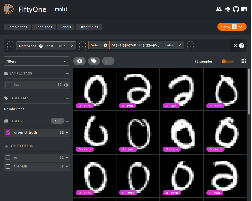
session = fo.launch_app(view=test_split)

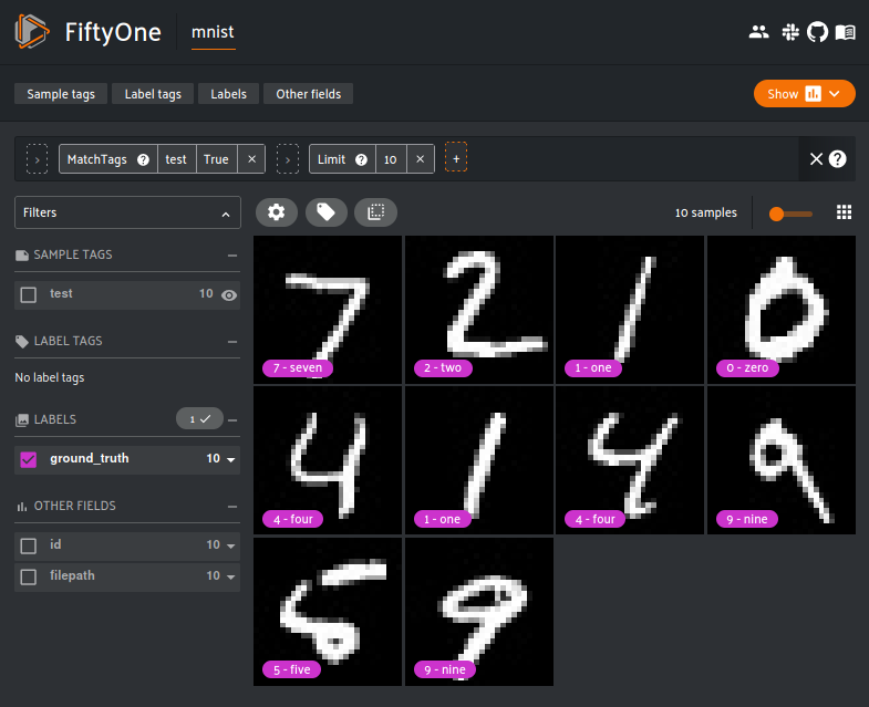
The FiftyOne App is a convenient GUI for browsing, visualizing and interacting directly with the dataset. All the user needs to do is supply the FiftyOne dataset object. The App can be used either locally, through the cloud or inside a Jupyter or Colab notebook.

The filters can be cascaded to get even finer subsets of the dataset. The above example chains the MatchTags and Limit filter in action. First, the MatchTags filter only allows data with the ‘test’ tags is displayed. The Limit filter allows the first 10 pictures to be displayed. With this, only the first 10 test data out of 10,000 data is shown. Creatively chaining the filters can produce some very fine grained data subset.

Once the dataset visualization is done, it is time to view the embeddings visualization results.

# Plot embeddings colored by ground truth label
plot = results.visualize(labels="ground_truth.label")
plot.show(height=720)

# Attach plot to session
session.plots.attach(plot)

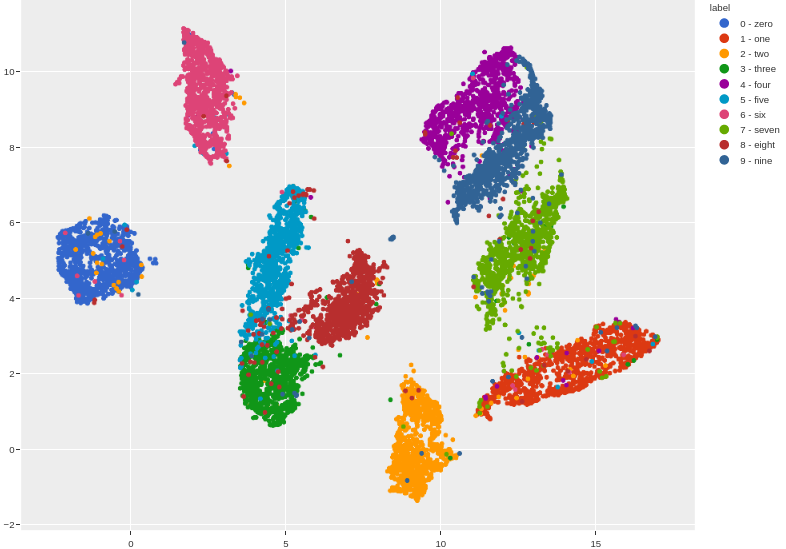
The separation of each class is quite distinct and can be seen even without outlining. The vast majority of the data are clustered correctly. However, each clusters also have outliers belonging to other clusters.

To take a look at these outliers relative to the cluster, the lasso tool can be used to isolate the points. For example, if I want to see the class 2 outliers in the class 0 cluster, I can first filter out the other classes, then lasso the outliers.

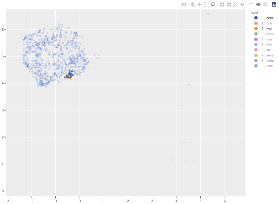
Resetting the FiftyOne App displays the lassoed points.

From the three class 2 outliers we can deduce the failure mode: some of the class 2 hand-writings are poor. If the tail is not written correctly, these 2s will look like either a reflected 6 or 0, which is probably why these data are incorrectly clustered as 0s.

With the findings there are some improvements that can be done. These outliers can either be re-annotated or removed from the dataset entirely. Given my previous points, removing these outliers is probably a safer bet.

Conclusion

We looked at the motivations of using specialized tools like FiftyOne to do data visualization. Specifically, we looked at how embeddings visualization can produce clusters that can reveal interesting insights, such as the data quality and failure modes. Explanations for outliers and suggestions to deal with them are briefly looked at.

Of course, FiftyOne comes with a lot of other powerful tools and features. Those who wish to improve their machine learning pipeline should really consider using FiftyOne or similar tools.

That’s all for this post. Thanks for reading, and stay tuned for future posts.

Visualizing Convolutional Networks with Grad-CAM

Artificial intelligence have made significant transformations, both good and bad, to various applications and industries. Yet to a lot of the layman, putting so much faith in obscure deep learning algorithms is like opening the Pandora’s box. After all, how can the models be trusted if how they work is not well understood?

Sadly, the fear of the unknown often is an obstacle towards embracing new technologies. The truth is that how AI models work can in fact be discovered and studied. Today’s post will focus on convolutional neural networks, and how their inner workings can be made explainable with Grad-CAM.


What is Grad-CAM?

In Grad-CAM: Visual Explanations from Deep Network via Gradient-Based Localization by Selvaraju et al, the authors proposed a technique to produce ‘visual explanations’ for CNN based models.

They noted that when AI models fail, they often fail spectacularly and without explanation, leaving users baffled at how the system failed.

In the paper, the importance of model ‘transparency’ at 3 different stages of AI is briefly mentioned:

   - when the AI is weaker than humans, transparency is needed to understand failure modes.

   - when the AI is on par with humans, transparency is needed to establish trust in users.

   - when the AI is stronger than humans, transparency is needed to teach humans how to make better decisions

Here, the premise that interpretability matters is outlined.


Good Visual Explanation

What constitutes a good visual explanation? A good visual explanation should be both class-discriminative and has a high resolution.

Class-discriminative means that the model can accurately localize the key features of the target object. High resolution means that the fine-grained details of the object features can be captured.

Both concepts are explained with the images above from the paper. Suppose that the model wants to detect cats. Picture (c) shows class-discrimination in action: the heat-map indicates how the model accurately localizes on the cat instead of the dog. In picture (d), the body and stripes of the cat are illustrated. The model can classify the animal as a cat from the feline shape, but also correctly classify it as a tiger cat because the model sees the stripes.


Architecture

The image is first propagated to the CNN part of the network, then through the task-specific portion of the network (classification, captioning, etc…). The gradients are set to zero for all classes save the desired class (one hot).

This one-hot tensor is then backpropagated to the ReLU layer, after which the feature maps of interest is combined to get the Grad-CAM localization (class discrimination). The heatmap is multiplied with the guided backpropagation to get the guided Grad-CAM (high resolution).


Testing Grad-CAM

There are numerous Grad-CAM implementations online, like this or this. However, this repository has the best Grad-CAM implementation I can find. Many thanks to Jacob Gildenblat and other contributors.

For the purpose of testing, a ResNet34 architecture will be used highlight the mechanisms of image classification. Let’s first look at the ResNet34 architecture.

We are interested in the 4 convolutional layers (conv2_x, conv3_x, conv4_x and conv5_x).

The convolutional layers are implemented as layer1 to layer 4 in PyTorch. The ResNet building blocks are omitted for the sake of concise illustration.

A input dog image is fed into a ResNet34 model pretrained on the ImageNet dataset.

Grad-CAM visualization (layer1-layer4).


We can see how the classifier gradually improves layer by layer.

In layer 1, the heatmaps are dispersed through the image, capturing not only dog but also the background, a sign of poor class discrimination. This gradually improves through layer 2 and 3 as there are progressively fewer heatmap clusters, focusing more on the dog’s boundaries. Finally, in layer 4, the heatmaps are well localized on the dog’s head, paws, hind legs and tails.

On the other hand, the guided backpropagation Grad-CAM is consistent across all the layers.

Surprisingly, the defining features of the dogs are well captured even at the first layer. Looking at the well-defined head features, intuition would tell us that this should be a layer 4 guided backprop Grad-CAM. However, even at layer 1 with supposedly poor class discrimination, the dog’s head is well defined.

Localizing and defining the dog’s head features is useful. Even if the dog’s body is obscured or deformed in other images, the classifier can still correctly identify it, because the head features have more weight in the decision making step.


Conclusion

Hopefully, this post gives you a cursory idea on how to visualize CNN models using Grad-CAM. The motivations for model visualization, as well as test examples, shows the value of dissecting deep learning networks to gain a better understanding of it.

There are variants of Grad-CAM out there, such as Grad-CAM++, AblationCAM and EigenCAM that are worth exploring in your downtime.

Happy coding, and I will see you on the next time.

Xarray and Dask: An Alternative to GDAL and NumPy

A common task for GIS (geographic information systems) engineers is to extract regions from a map. Given a TIFF file and some coordinates (in dataframes or other tabular form), the regions of interest are cropped using slicing or some other indexing methods.

One approach to this task is to use the GDAL-NumPy solution. The TIFF file is loaded as a GDAL raster object. Then the raster object is converted into a NumPy array. Regions of interest can simply be cropped with Python slicing.


The Problem

This kind of solution is fine for small examples, but would scale poorly with larger datasets.

Firstly, Python is a language designed for rapid development and prototyping at the expense of speed. Now imagine trying to crop out thousands of regions from maps that are tens or hundreds of gigabytes big.

Secondly, GDAL is notorious for its poor threading support. The GDAL docs has stated that the GDALDataset object should not be accessed from different threads at the same time. Any attempts to parallelize the task with Python’s threading, process or concurrent.futures module will just crash the program. Trying to crop big TIFF files sequentially would be prohibitively slow.

Lastly, loading the crops take up a lot of RAM. The solution would not work if the crops cannot fit inside the RAM. Ideally, the solution should also work for machines with limited RAM, not just beefy workstations.

Fortunately, Python has libraries like Xarray and Dask that exist to tackle this sort of problem.


Xarray

Xarray is an open-source Python package that makes working with multi-dimensional arrays efficient. Think of it like NumPy on steroids.

Like GDAL, Xarray comes with the ability to load TIFF rasters as a DataArray. The DataArray object behaves a lot like GDAL’s DataSet object, supporting features like metadata querying and other GDAL operations. Because the DataArray operates like a NumPy array, typical NumPy indexing and operations can be applied to it. There is no intermediary conversion from DataArray to NumPy array.

Compared to GDAL, Xarray’s dataset has much better parallelization support, especially with Dask. As of this post, Dask is an optional feature, but the benefits are sufficiently strong that it may become a required dependency in the future.


Dask

Dask is a parallel computing library written to handle large NumPy-like data structures.

Unlike NumPy, which uses eager evaluation, operations on Dask are lazy. Dask functions are first converted into task graphs. As shown in the Dask Delayed docs:


Each inc operation run lazily. Execution is deferred until the value is needed. When the results of the inc operations are required, Dask will run both operations in parallel. This is a simple example, but can be extended for more complex functions.

Another benefit to using Dask is that it can work with datasets that are too huge to fit into RAM.

More on parallel computation with Dask can be found here.


Benchmarking

TIFF croppings for 12000, 62000 and 120000 ROIs using GDAL (Python/C++) and Xarray-Dask are benchmarked:


GDAL uses GDAL_Translate to crop out ROIs. Cropping with GDAL is done sequentially due to the poor threading support. Even though the C++ implementation is faster, the cropping time using GDAL still increased exponentially.

Meanwhile, Xarray/Dask is blazing fast even at 120000 ROIs. The speedup is very noticeable: at 120000 ROIs, Xarray/Dask has a staggering 219 times speedup.

That wraps up today’s post. If you want to learn more about Xarray and Dask, this and this are good places to get started. Hope you learned something useful today.

1 2 Next Last